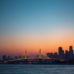
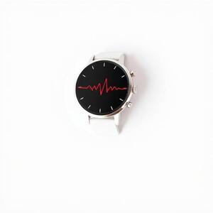
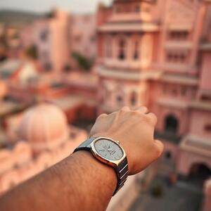
Mumbai
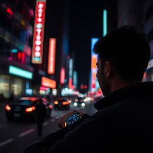
Fast lanes and harsh sun. The dial keeps edges crisp so you read battery and weather in a blink.
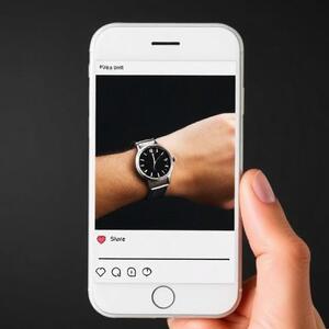
Journal
The CELEST5320 journal collects moments from Indian cities and beyond: morning commutes in Mumbai, evening walks in Bengaluru, coastal breezes in Chennai, and late-night study sessions in Delhi. Light design, pilot clarity — always at your wrist.


Four cities, four rhythms. We tune contrast, spacing, and motion for real-world light and pace.
Fast lanes and harsh sun. The dial keeps edges crisp so you read battery and weather in a blink.

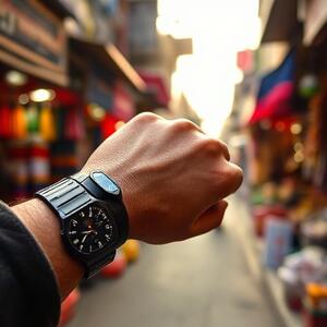
From bazaars to boulevards, primary numerals hold hierarchy even at small sizes.

Workday clarity: motion rests by default; information speaks only when needed.

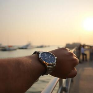
Sea glare meets calm type. Accents imply state, not decoration.
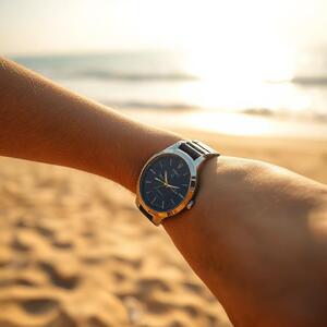
A light aesthetic fits formals, campus casual, and active wear. The dial’s neutral steel tones complement colors without fighting for attention.


Small cues, steady habits. Four stories from the community.

Edge contrast helps read levels at a glance; fewer fills save charge across the day.
Primary numerals stay legible under sun; campus walks feel more intentional.
Quick checks during runs; motion rests when not needed.
Glanceable icons and spacing keep context without clutter.
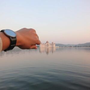
Short trips, long memories. The face stays clear wherever you go.

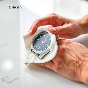
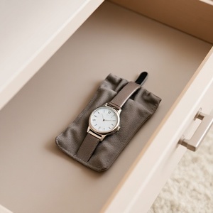
Keep the watch and strap ready for every day. A few simple habits make all the difference: gentle wipes, dry storage, and strap checks.

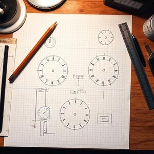
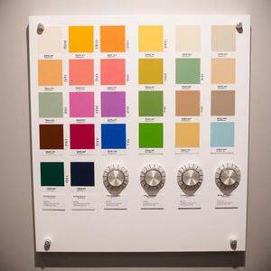
Sketches, textures, and color checks from the studio.


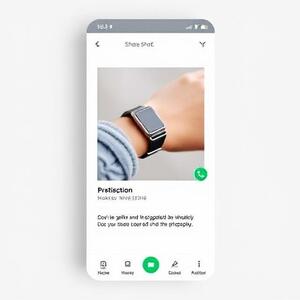
Users across India share how CELEST5320 fits their day — from early runs to late-night projects.


Open Appearance → Select CELEST5320 → Apply. Configure complications as needed.

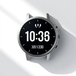
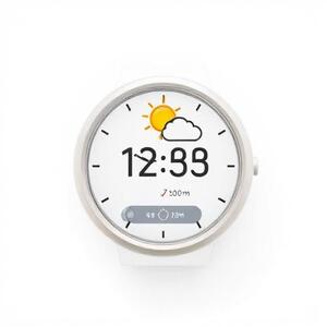
Pick battery, steps, heart rate, and weather. Keep it signal-first and clutter-free.
Essentials only: markers remain; decor rests. Read at a glance, save power.
If the journal inspired you, try CELEST5320 today and share your wristshots. Tag your city and a moment you loved — sunlight, rain, or neon nights.

Reflections from the road: design in the sun, motion in the margins, and why clarity outlives trends.
India changes pace every few minutes. A bus pulls in, a vendor calls out, a notification buzzes; then the city exhales and a gentle breeze crosses the platform. In this rhythm, a watch face is not a poster. It is a low-friction interface that you glance at for a fraction of a second and then forget—unless it fails.
The heart of CELEST5320 is a simple promise: read once, act once, move on. We found that reducing the amount of filled surface on OLED does two things at once: it limits power draw and increases salience of the remaining edges. Edges are where recognition begins. When edges are crisp, eyes resolve values faster, sunlight becomes less of an adversary, and the battery breathes easier. That is why we disciplined accent usage to signal state, not decoration.
Consider a typical day in Mumbai. Sun at noon can flatten colors and overwhelm small glyphs. By raising edge contrast and stabilizing spacing, we reduce the cognitive search loop: you do not hunt for the heart rate, you simply find it. On quieter evenings in Bengaluru, the same layout rests; no animated flicker competes with your focus. Motion appears only when it informs state.
A hierarchy is not a pile of sizes. It is the careful choice of distances, weights, and timing. Primary numerals must be obvious without shouting; secondary labels should feel helpful without clogging the field. We rely on Regular (400) for body, Medium (500) for labels and controls, then reach for Bold and ExtraBold only when a turn of the dial requires emphasis.
“A good dial is quiet at rest and articulate under pressure.”
Many faces chase “novelty” by drawing large filled shapes or looping subtle animations that never quite stop. Novelty ages quickly; clarity does not. The cockpit metaphor endures because pilots work under time pressure with real stakes. That does not mean we copy flight instruments literally; it means we adopt their ethics: signal first, ritual later.
Designers often craft in studios, lit just so. The wrist lives elsewhere. In Jaipur or Chennai, glare is not a bug but a constant. We tested layouts outdoors to see what survives: stroke weight, spacing, and icon language that maintains affordance when the panel is dimmed and the world is bright. When your eyes squint, the dial should not.
This is also why we changed how we think about color. Saturation turns loud under the sun. Instead of flooding surfaces with bright paint, we mark edges and let the panel rest. Accents highlight exceptions—low battery, unusual heart rate, incoming weather—then fade back to neutrality. The result is composure: attention goes where it should and nowhere else.
Animation is not the enemy; idle motion is. If movement has no semantic value, it taxes both mind and cell. CELEST5320 uses easing as feedback—tiny confirmation that an action registered, or a state changed. On AOD, almost everything decorative disappears. What remains is a distilled reading: time, direction, and the few markers that matter in the dark.
India’s reading patterns differ across scripts and habits; even within English locales, numeral rhythm can vary. We avoided clever alignments that break the moment numerals change width. Stable alignment reduces saccades: you spend fewer micro-movements to locate the same value on the next glance. It is a small thing that feels large once you notice it—like a door that always opens inward.
We also considered the difference between a “reading glance” and a “checking glance.” Reading is consumption, checking is orientation. A watch face lives in the latter. That is why labels are plain, numerals carry the weight, and icons act as landmarks rather than ornaments. When you are late for a train in Delhi, you do not want to decode a poster. You want an answer.
Battery is not a technical afterthought; it is a design constraint from the first sketch. Power awareness is the companion of clarity. A face that drains the day cannot be a companion. By limiting uniform fills, keeping motion purposeful, and managing contrast with restraint, we stretched endurance without starving personality.
We learned to resist the thrill of the demo. Demos are bright rooms and big screens. Reality is wrists and weather. In the wild, thoughtful restraint outperforms theatrical flair. The best compliment a watch face can receive is not applause but absence—you forgot it was there— because it never got in your way.
CELEST5320 is not trying to be every style at once. It is a deliberately narrow instrument crafted for India’s pace: sunlight, movement, and attention that is always going somewhere. If you notice the design too often, we failed. If you forget it between glances and still get what you need, we did our job.
The road ahead is simple: keep clarity first, listen to field notes from across India, and ship in small, measurable steps. The city will keep changing pace. The wrist will keep moving. Our job is to keep the glance light.